This event is over.
Data Visualisation for Monitoring & Evaluation
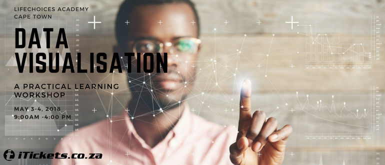
Introduction to Data Visualisation
In a world of information overload, it's necessary to ensure your organisations' stakeholders understand and utilise data effectively. Data visualisation includes techniques for clearly communicating information and data using visual tools such as graphs, infographics and dashboards.
In this course you will learn how to communicate research results, monitoring and evaluation results, and any other data with internal staff and external stakeholders using enticing and informative graphs, infographics and dashboards.
Target group
This course will benefit M&E and research consultants, NGOs, researchers,CSI managers, and government officials who are looking to improve how they communicate results with both internal staff and external stakeholders.
About the presenter
Robin Pocock holds a Master’s Degree in Programme Monitoring and Evaluation and has nine years of experience working as an M&E practitioner. She teaches data visualisation, statistics and quantitative data collection on the MPhil Monitoring and Evaluation Methods programme at Stellenbosch University. Robin is the M&E manager at Life Choices and provides services to other NGOs to develop and implement their own M&E systems.
Content
Both days will be packed with a little theory and a lot of practice!
Day 1
· Best practices for data visualisation
· How to create awesome charts in Excel
Day 2
· Creating dashboards in Google Sheets
· Creating Infographics in Piktochart
Cost includes the two days, refreshments, a flash stick with notes and a certificate of attendance.
For any queries or group bookings please contact 021 696 4157.